Good design is apparently harder than you might think.
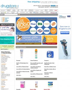
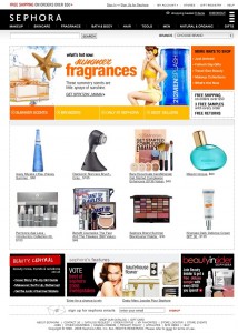
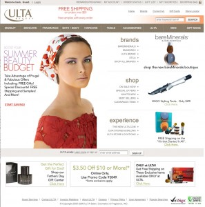
Let’s take a quick look at three big online cosmetic/accessory web store-fronts: Drugstore.com, Sephora.com, and Ulta.com.
I’m not an IA, so I won’t try to do a big analysis. I’m just going to let you look at the three different home page looks across the three companies. To me, Ulta.com stands out as having a much cleaner and more pleasing design than either of the other sites.


Leave a Reply