Semantic Tags
Use the right tags for the job. For high importance headings use <h1>, for lists use <li>, and so on. Don’t JUST use CSS classes for styling, make sure you’re also using the appropriate HTML markup for your content. By using semantic markup you can identify the importance and structure of the content and data on the page in a way that not only assists search engine crawlers, like GoogleBot, understand your content better, but also supports alternate browsers/web clients such as screen readers, other accessibility tools, and future applications.
Accessibility
By designing your site to be easily accessible to search engines, you also end up making it accessible to people with disabilities such as the blind or vision limited. Or you can look at it the other way: by designing your site to be accessible to people with disabilities and to be WAI or 508 compliant, you end up with an excellent site for search ranking.
It can often be hard to justify the cost and effort to make your site 508 compliant, even if it’s a legal requirement, however if you view it as a SEO effort, it’s much easier to assert a strong ROI on the project, and kill two birds with one stone.
You can read more about accessibility here:
Standards
Be sure you’re following standards and best practices around your markup. This includes having nicely structured, valid, HTML/XHTML markup, and also being sure you have accurate helpful alt and title tags on your links, images, and other dom elements.
See what GoogleBot sees
First you have to be able to see the page the way GoogleBot sees it. The easiest way is to use a text based web browser like links or lynx. GoogleBot is actually a customized version of lynx, and supposedly has been/is being improved to be able to cull some data out of Flash, and possibly even some Javascript driven content, however it’s best to assume that what lynx shows you is what GoogleBot sees.
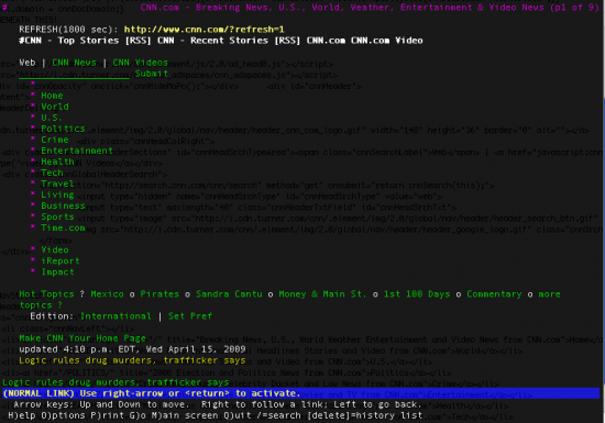
You’ll want to design your page structure and dom tree to be logical in order, structure, and semantic. Here is a view of CNN.com in lynx:
[fusion_builder_container hundred_percent=”yes” overflow=”visible”][fusion_builder_row][fusion_builder_column type=”1_1″ background_position=”left top” background_color=”” border_size=”” border_color=”” border_style=”solid” spacing=”yes” background_image=”” background_repeat=”no-repeat” padding=”” margin_top=”0px” margin_bottom=”0px” class=”” id=”” animation_type=”” animation_speed=”0.3″ animation_direction=”left” hide_on_mobile=”no” center_content=”no” min_height=”none”]
It’s extremely usable. You can see the main navigation first thing, and if you scroll down you see the main headline stories, latest news, etc… This is what you want your site to look like to GoogleBot.
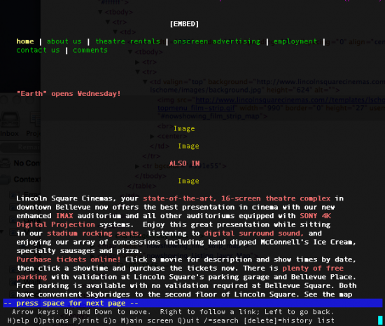
In contrast, here is what a large theatre’s website looks like in lynx:?

The primary navigation on the real site doesn’t even appear here. The images don’t have titles or alt tags, and the structure is lacking and confusing. This is NOT what you want your site to look like to GoogleBot.
[/fusion_builder_column][/fusion_builder_row][/fusion_builder_container]
Leave a Reply