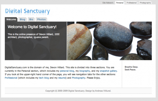
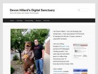
I’ve finally started redesigning my website. It’s something I’ve meant to do for ages, and I finally started today. As you can probably tell I’m not much of a “designer”. I’m just using the default WordPress theme, although likely that will change soon, although the default theme is much more readable than my previous design. The big improvement I’m focusing on is reorganizing the content and navigation to make the site more accessible.

The previous site’s home page was a short blurb about me, with links to various parts of the site. The site itself was broken into three main sections: Personal, Professional, and Photography. The reality is that the vast majority of visitors to my site wanted content that was part of my Tech Blog or my Resume.

My professional side drew most of the visitors to the site, and so the new design leads with a summary page of my professional world: my projects, my recent Tech Blog posts, Twitter feed, etc…
I plan on migrating from two locally hosted Gallery instances: personal and professional photos to using Flickr for personal stuff and 500px for portfolio work. I also plan on moving several standalone HTML pages into WordPress pages to they are easier to manage.
I welcome feedback and suggestions! Hopefully my site will be easier to use and I will try to update it more often.
Leave a Reply