Here is a great idea on how to market to me: Sell me an image or a story, and then sell me a series of products.
[fusion_builder_container hundred_percent=”yes” overflow=”visible”][fusion_builder_row][fusion_builder_column type=”1_1″ background_position=”left top” background_color=”” border_size=”” border_color=”” border_style=”solid” spacing=”yes” background_image=”” background_repeat=”no-repeat” padding=”” margin_top=”0px” margin_bottom=”0px” class=”” id=”” animation_type=”” animation_speed=”0.3″ animation_direction=”left” hide_on_mobile=”no” center_content=”no” min_height=”none”]
I don’t mean sell me a JPG image or a PDF story, I mean sell me on a style, a look, a lifestyle, a moment-in-time that I want to be a part of. Show me something that makes me envious or makes me say “I wish I looked like that guy” or “I wish I was doing that” or “If only my house looked like that”. This is the core of most print ads, tv commercials, and the like, but is a selling method that hasn’t translated online much yet.
[/fusion_builder_column][fusion_builder_column type=”1_1″ background_position=”left top” background_color=”” border_size=”” border_color=”” border_style=”solid” spacing=”yes” background_image=”” background_repeat=”no-repeat” padding=”” margin_top=”0px” margin_bottom=”0px” class=”” id=”” animation_type=”” animation_speed=”0.3″ animation_direction=”left” hide_on_mobile=”no” center_content=”no” min_height=”none”]
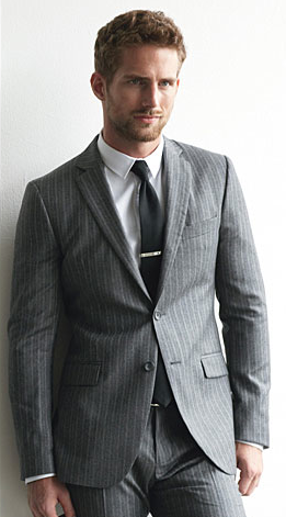
Magazines do this to me all the time. If I flip through a copy of Dwell, I’ll see a ton of photos of beautifully decorated rooms, and think to myself “Wow! If only my dining room could look like that!” or even just “That clock is amazing, and goes perfectly with that mirror”. If I open GQ or Maxim there are multi-page spreads of various male models wearing various outfits or suits. Typically I’ll see at least one look and say “Man I wish I could pull that off”. Or even your typical selling-via-sex ad with a beautiful woman in a slinky dress, making me wish I was the guy in the ad. Hey, it works.
The fundamental issue with these examples though, is that there’s no easy way for me to actually BUY anything. You’ve moved me into a headspace where all of a sudden I want something, but you aren’t letting me actually buy it. Sure, the mens fashion spread may list items like “jacket by Calvin Klein, jeans by Rock n Republic” but there’s no way for me to easily know exactly the style/model or where I can find them. Much less for all the items of the look/outfit.
If you’re an online vendor you can easily offer that next step. You can link to each item and offer a “buy this bundle” option as well. You can make it easy, and you can capture my dollars.
This is a huge opportunity for online eCommerce vendors to capture unfocused shoppers.
There’s a little more cost and effort in setting up the photo versus your standard product photo against a white background, but by building images that will let you sell high-end and high-margin products you will easily come out ahead. Your companies print marketing or catalog group may already have images that you can use online without any added cost.
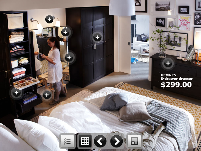
One company that is doing a great job of this already is Ikea. If you go to Ikea’s website and click on the Living Room navigation tab, instead of seeing a bunch of disjointed products against white backgrounds, you see a living room, filled with Ikea products. Hot spots in the image let you click to find out more about a given product, pricing, options, etc… If you click though to look at bookshelves you see bookshelves with real BOOKs on them.
Make your products sexy, make them elements of a lifestyle people will want, and make it easy to buy the whole package.[/fusion_builder_column][/fusion_builder_row][/fusion_builder_container]
Leave a Reply